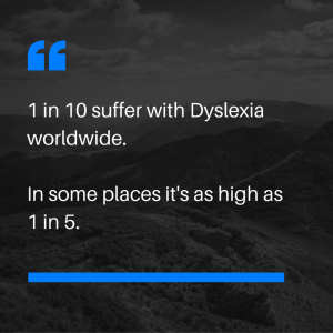
As web developers and designers, we have a responsibility to think about the accessibility of our designs. Consider the fact (a startling one to me) that 1 in 10 suffer from dyslexia worldwide. In some parts of the world this can be as high as 1 in 5!
That’s a lot of people who will be struggling to varying degrees, with the way content is displayed online.
So what do we need to keep in mind?
Letting people know in advance how much content they are going to be going through by using numbered lists is useful.
10 things to keep in mind….
- Make the menu clear and obvious, buttons are great.
- Do not put up a ‘Wall of Text’ on a webpage.
- Break up the content, into small readable sections, numbered lists, images etc
- Use ‘Click here to read more’ or similar, so minimising content and can choose to read more.
- Make a clickable link look like a clickable link.
- Numbered lists are good, especially when scrolling on a device, you can lose your place sometimes.
- Font needs to be easy to read with good spacing between the lines.
- Clean and clear, simplify. It can still look cool!
- Consider a background colour on alternating sections of text to help focus the eyes.
- Breadcrumbs are necessary on a big site
None of the points above are rocket science, we can all do our bit to make it easier.

One thought on “Dyslexia and the Internet Experience”
Comments are closed.